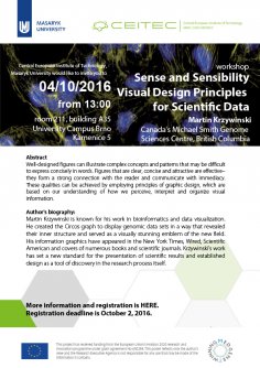
Abstract
Well-designed figures can illustrate complex concepts and patterns that may be difficult to express concisely in words. Figures that are clear, concise and attractive are effective–they form a strong connection with the reader and communicate with immediacy. These qualities can be achieved by employing principles of graphic design, which are based on our understanding of how we perceive, interpret and organize visual information.

We all use words to communicate information–our ability to do so is extremely sophisticated. We have large vocabularies, understand a variety of verbal and written styles and effortlessly parse errors in real time. But when we need to present complex information visually, we may find ourselves at a ‘loss for words’, graphically speaking.
Do images and graphics possess the same qualities as the spoken or written word? Can they be concise and articulate? Are there rules and guidelines for visual vocabulary and grammar? How can we focus the viewer’s attention to emphasize a point? Can we modulate the tone and volume of visual communication? These and other questions are broadly addressed through design, which is the conscious application of visual and organizational principles to communication. All of us have already been schooled in ‘written design’ (grammar) and most of us have had some experience with ‘verbal design’ (public speaking) but relatively few have had training in ‘visual design’ (information design and visualization).

This talk distills core concepts of information design into practical guidelines for creating scientific figures. We will explain how to generate visual vocabularies with graphical elements, combine them into phrases, and package them into a complete figure, the visual equivalent of a paragraph. We show how effective designs for this composition are underpinned by conclusions from studies in visual perception and awareness.
Participants are encouraged to send me (martink@bcgsc.ca) one of their particularly vexing figures (EPS, PDF or AI) for redesign and inclusion in the talk.
Speaker's Biography:
 Martin Krzywinski is known for his work in bioinformatics and data visualization. He created the Circos graph to display genomic data sets in a way that revealed their inner structure and served as a visually stunning emblem of the new field. His information graphics have appeared in the New York Times, Wired, Scientific American and covers of numerous books and scientific journals. Krzywinski’s work has set a new standard for the presentation of scientific results and established design as a tool of discovery in the research process itself.
PLEASE REGISTER - registration deadline is October 2, 2016.


